CG6Lemon
Detailing Enthusiast
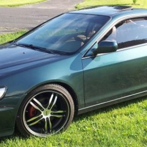
One month update on Carpro DLUX coating. Looking good!


Last edited:

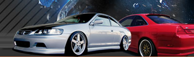

 headlight coating marketing by Limny Kuang, on Flickr
 glass coating marketing by Limny Kuang, on Flickr
 paint correction marketing by Limny Kuang, on Flickr
")
That paint correction is amazing. I really need to have that done but haven't had the time to find a good detailer around me. Actually I could just use a new paint job.
Always appreciate your feedback Chris. Believe it or not, there are more hacks out there than legit/good detailers due to the fact that anyone can grab a towel, a bucket with soap and "claim" they are a detailer....
When using fonts, legibility and consistency are key in helping translate your message. So pick one font, and maybe two variations of that font (change up color, transparency, italics/boldness, size, etc) and stick with it. The variations just need to relate to each other. Also helps to use photos that allow you to arrange the text the same way in each image, which makes it all easier to read. When the viewer goes from one image to the next, they have an expectation that they will see the same thing in the same place (i.e. DetailedByPrecision should be in the lower right corner in every photo).
Atm I'm just using Time new roman with bold and bold italic. Trying to keep it simple. I'll remember to keep the company name in the same position from now on. I was just testing it to see how the outcome looked when placed differently.
So to me the first (top) image is the best. First off it's cropped well. One font is white, the other slightly opaque. The DetailedByPrecision is the same font and it being black relates to the other colors in the image. There is good spatial awareness in that the text relates well to the content of the photo, nothing is interrupting/running into anything else. Your product is highlighted/accented while the background is more muted which draws attention to it. I think my only criticism there is that the margins should match, so the first letter in Restored, Protected, & Clarity should line up. Hope that all makes sense, it does in my head haha.
I'll redo it and see if I can align the wordings better. I'm pretty sure it's as far left I can put it, but I will double check....
In the second photo, the word Glass is kind of lost in the background, and its hard to tell if you were trying to match it with the color of the three words below, or if you wanted it to be different. Also, the first letter of those three words don't line up.
I wanted it to be different, but the end result was too many color variants all over the place. I'm going to redo it and match the other 3 wording with the same color as the "glass".
I think for the third one, a photo that shows a larger section of the corrected area would be better to sell/show off your services and give you room to not have to arrange the word vertically. And I think Precisely and Corrected would read better together if they were the same font style.
For this picture I had a hard time debating where to add in the wording. The corrected on the far right did not work out and I will replace it in a different area. And the company logo will be back on the far right corner with a different color font.
Okay I'll stop, hope I didn't offend you. Just my feedback if you are interested. I think you're on the right track and I admire the steps you have taken to conduct your own business. Glad to see you update in here!
woot woot paint correction all day baby!!!
but would have to agree the first photo with font looks great bro. much biggups and props on starting your business.